HERA Example Data
For this example we use synthetic datasets that are based on characteristics of real MRI Images. The original datasets are not included in this repository and results with these will be published in a future paper. As an example for quality metrics to objectively evaluate image quality, we use Optical Contrast (OC), Signal-to-Noise Ratio (SNR) and Contrast-to-Noise Ratio (CNR). These metrics and the way they were calculated and prioritized for the HERA analysis are based on the concept and results of Noeth et al., NMR Biomed. 2015; 28: 818-830.
Note
The example results and interpretations shown below serve as a didactic walkthrough to demonstrate HERA’s decision-making capabilities. Please be aware that running the examples with different seeds may yield slight variations—for instance, in the precise bounds of confidence intervals or in tie-breaking outcomes—which can lead to a different overall ranking for some methods compared to the static screenshots. These differences reflect the inherent stochastic variability of bootstrap resampling.
Example use case 1
For this example, we introduce a new imaging technique, Method D, designed to enhance the visualization of a specific Region of Interest (ROI) of up to 100 percent. We retrospectively compare Method D against five established imaging methods. Image quality metrics were automatically extracted and stored in CSV files. Our goal is to identify the optimal imaging methods for visual quantification in a subsequent study. Manually evaluating all 6 methods across 30 patients would be prohibitively time-consuming. Furthermore, if Method D is not identified as the superior method, we would need to adjust its parameters and repeat the analysis for all methods. Therefore, we employ HERA to select the top three imaging methods for the final study.
We prioritize Optical Contrast (OC) as the primary metric, given its strong correlation with visual image quality ratings. Contrast-to-Noise Ratio (CNR) is used to compensate for lower OC, as high contrast is ineffective if noise levels are excessive. Signal-to-Noise Ratio (SNR) is prioritized last; while a lower SNR is acceptable if contrast is sufficient, a significant reduction in SNR can compromise overall image quality. Since these metrics have different scales, direct comparison or weighted prioritization is challenging. HERA helps us navigate these trade-offs to determine the best possible image quality for our specific application.
Interpreting the results 1
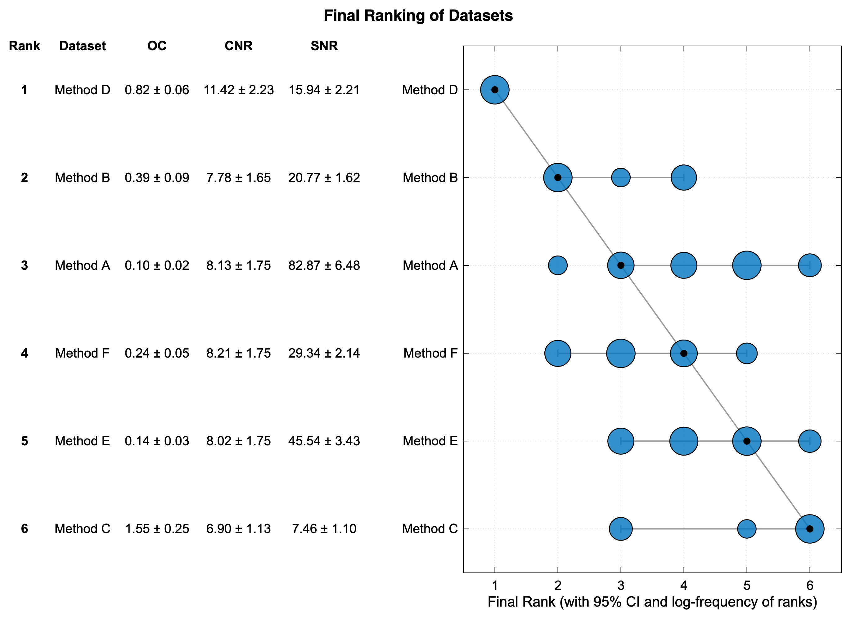
The whole analysis took about 4 Minutes to complete on a standard Laptop (Base Model Apple 16" 2021 M1 MBP, 16 GB RAM). The final report PDF provides guidance on interpreting the results. Detailed Statistics are provided in the Ranking Report PDF. In this example, Method D is ranked first, followed by Method B and Method A. However, Method A exhibits a 95% confidence interval ranging from rank 3 to rank 6, whereas Method F is ranked fourth with a confidence interval between rank 2 and rank 4.
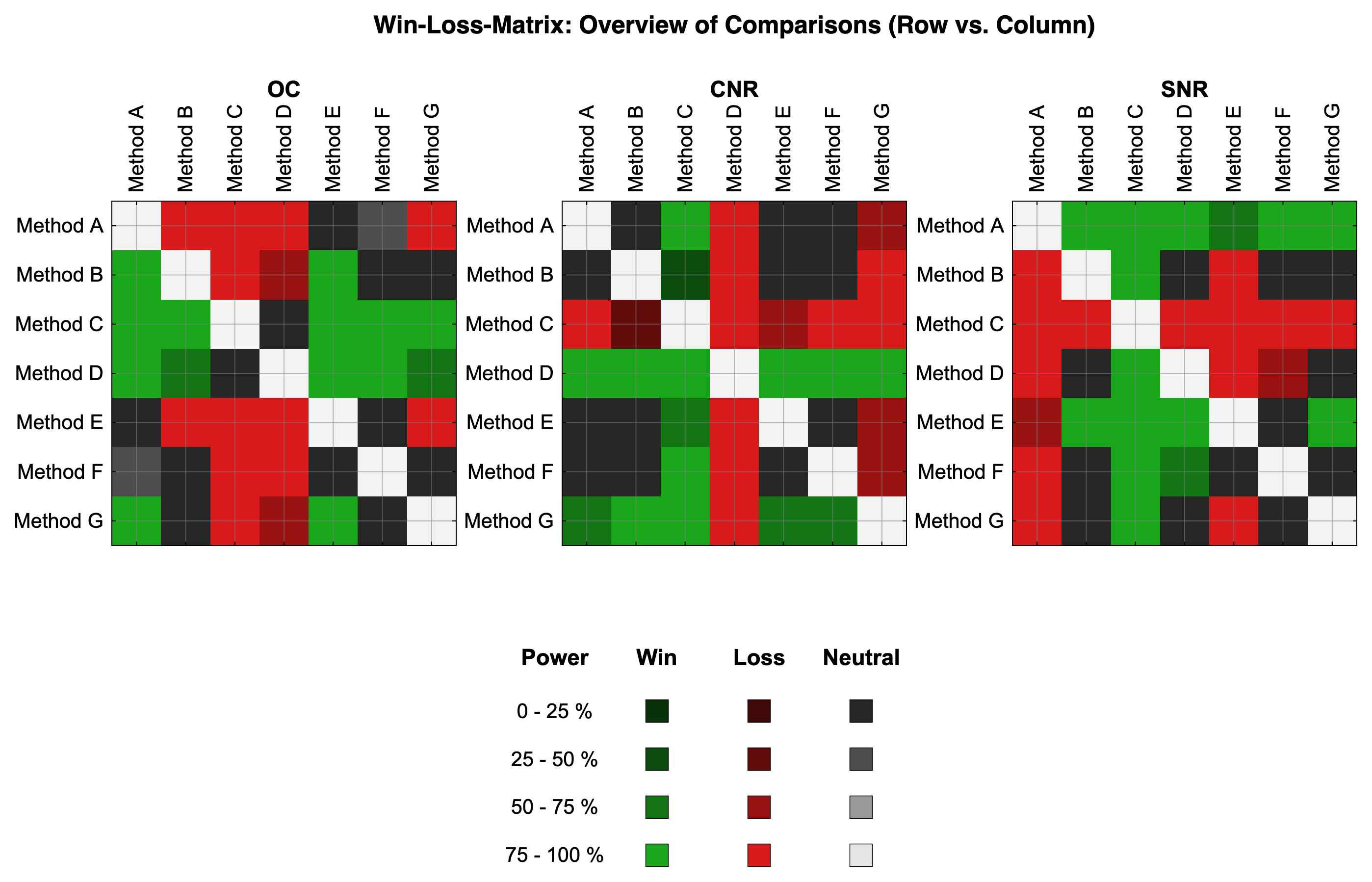
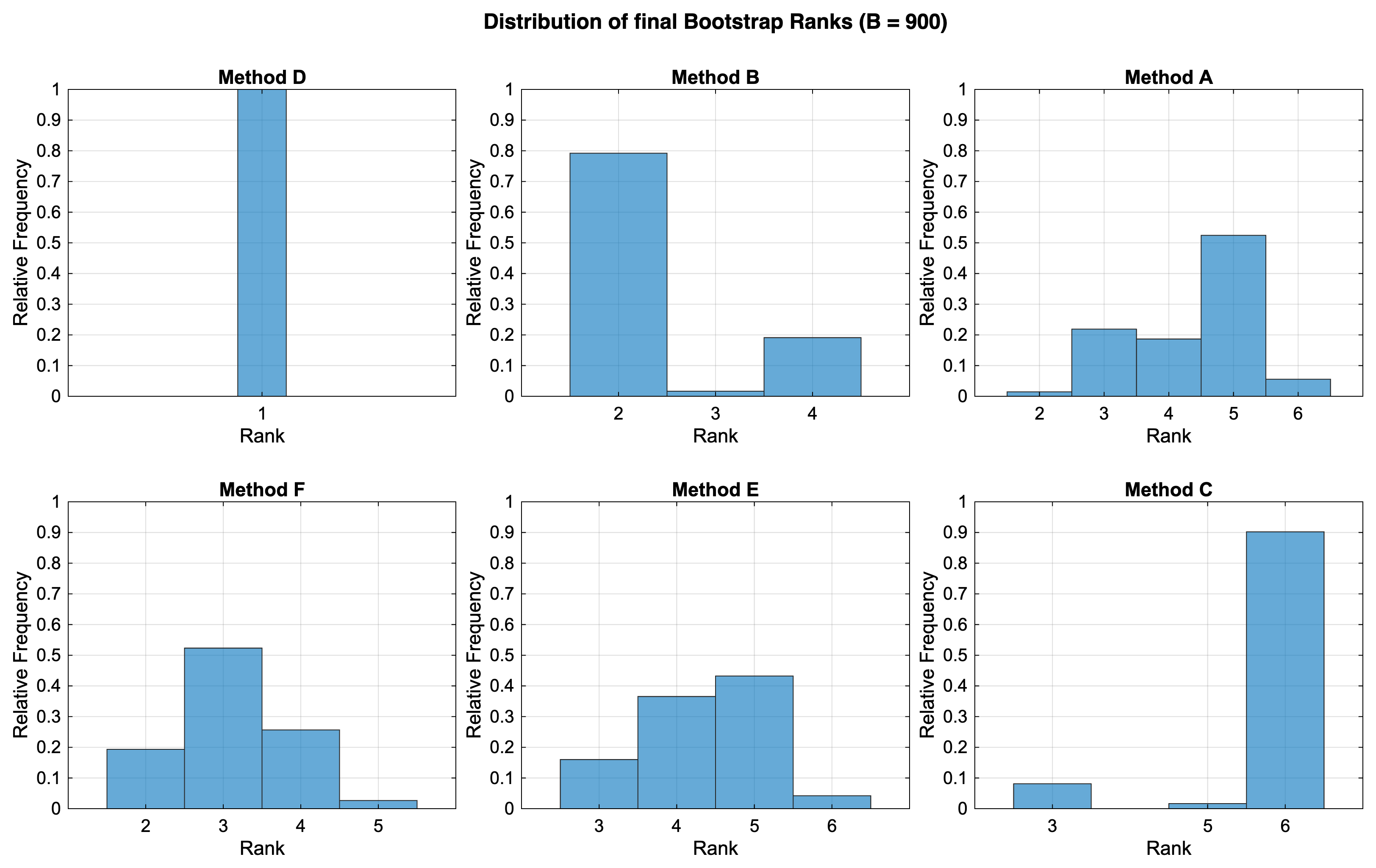
The Sankey Diagram reveals that Method A's ranking is largely driven by its high SNR. The rank distribution under resampling conditions indicates that Method F frequently achieves a higher rank than Method A. Analysis of the Win-Loss Matrix and the CSV log file suggests that Method A outranks Method F partly due to a win in SNR against Method E, albeit with only 50% power.
Sensitivity Analysis shows that both Method A and Method F have comparable Borda Scores. Crucially, our new technique, Method D, achieves the highest Borda Score, indicating that its top ranking is robust and not solely dependent on our specific metric prioritization. Method B's lower score is primarily due to permutations where SNR is prioritized over OC and CNR. Consequently, for our final analysis, we would select Method D, as it demonstrates the highest stable rank and the highest Borda Score, along with Method B and Method F.
Example Results 1
Below are visual outputs generated from the Example_1 dataset using HERA.
Final Ranking 1
The final ranking of the methods based on the hierarchical-compensatory logic with the confidence interval.
Distribution of Bootstrap Ranks 1
This diagram displays the frequency of each rank achieved by the methods across the bootstrap samples, illustrating the uncertainty in the ranking.
Rank Shifts (Sankey Diagram) 1
This diagram shows how the ranking of methods changes across different metrics and their hierarchy level.
![]()
Win-Loss Matrix 1
This matrix visualizes the pairwise comparisons between methods. Blue indicates a win, orange a loss, and gray neutral due to the Threshold criteria not being satisfied. The color intensity indicates the power of each comparison.
Example use case 2
We began evaluating the initial images from Method D, Method F, and Method B. Although Method D appears to offer the best overall image quality, we observed that its contrast enhancement occasionally leads to an over-representation of the Region of Interest (ROI). Conversely, the Contrast and Image Quality of Method B seem to depict the ROI size more accurately. Consequently, we sought to determine the optimal setting where Method D remains superior to Method B without excessive contrast enhancement that could compromise SNR as well.
To achieve this, we used the same metrics as in Example 1 but introduced a new method, Method G. In Method G, we iteratively reduced the contrast enhancement calculated for Method D until it was just robustly superior to Method B. We retained all original methods, including Method D, in the analysis for comparison. Since we had already established the required number of bootstrap iterations for our data characteristics, we repeated the analysis with a fixed iteration count, reducing the HERA runtime from 4 minutes to 1 minute for each analysis step on the same standard M1 MBP.
Interpreting the results 2
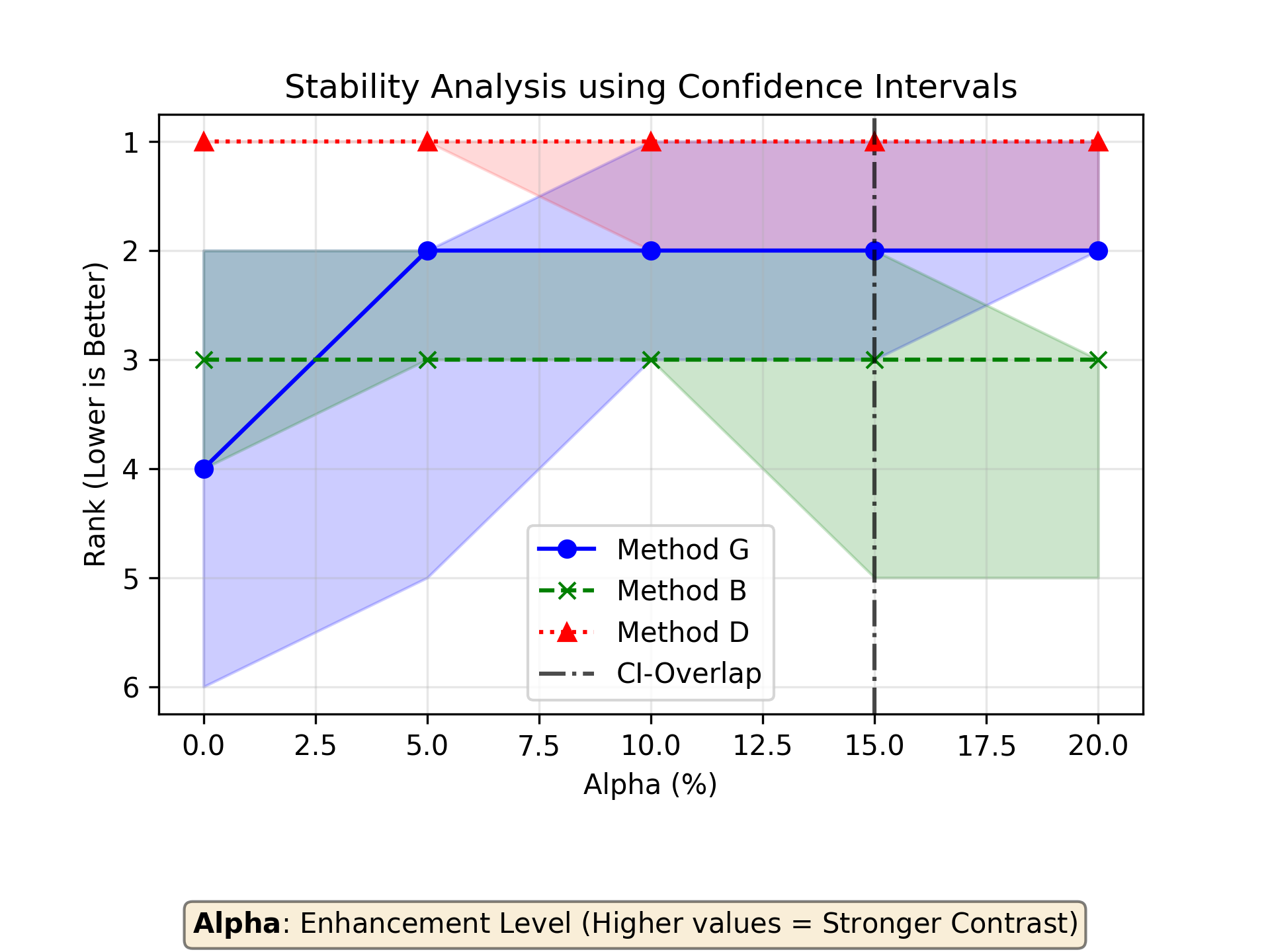
We progressively reduced the contrast enhancement of Method G to 20%. Below this threshold, Method G begins to lose its robust superiority over Method B, and at 15%, its confidence interval overlaps with that of Method B.
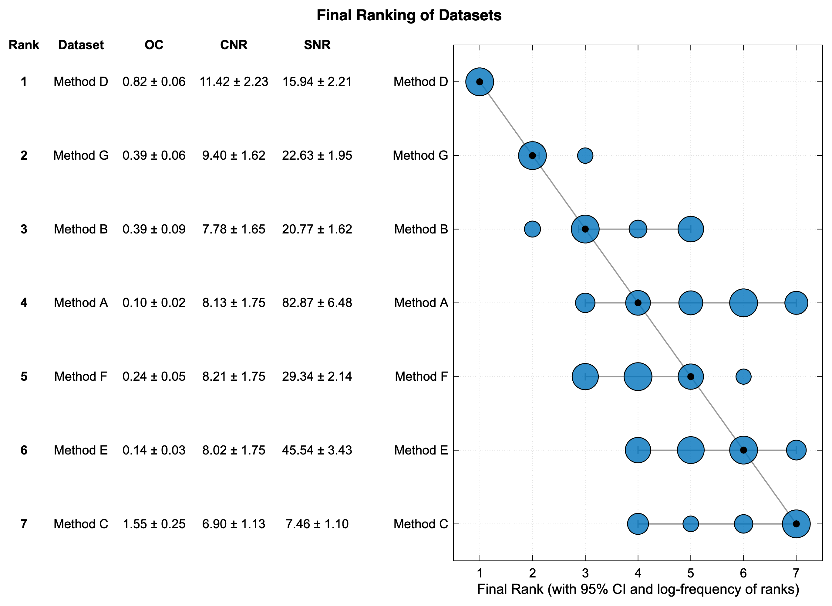
Examining the final ranking for Example 2, we see that the addition of Method G does not fundamentally alter the initial ranking. Method G achieves a rank of 2 within its 95% confidence interval and secures the second-highest Borda Score. Based on these findings, we can proceed with recalculating our image enhancement technique using 20% contrast enhancement for the final analysis. However, as demonstrated in this use case, quality metrics alone do not guarantee that the identified top candidate is optimal for the specific application. The final results should always be critically reviewed and validated within the targeted application context.
Example Results 2
Below are visual outputs generated from the Example_2 dataset using HERA.
Stability Analysis for Example 2
This curve visualizes the stability of the ranking results while decreasing the contrast enhancement of Method G.
Final Ranking 2
The final ranking of the methods based on the hierarchical-compensatory logic with the confidence interval.
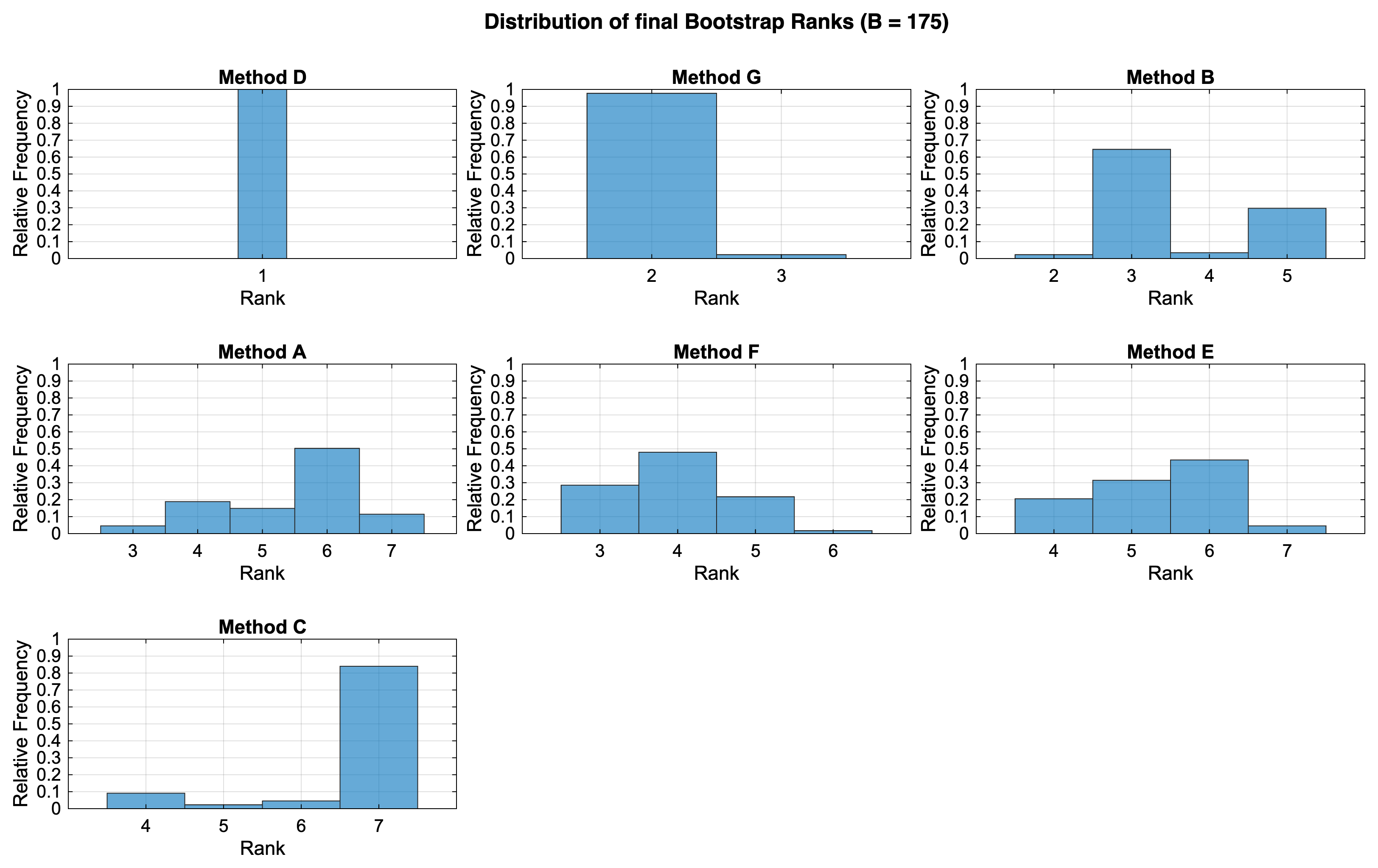
Distribution of Bootstrap Ranks 2
This diagram displays the frequency of each rank achieved by the methods across the bootstrap samples, illustrating the uncertainty in the ranking.
Rank Shifts (Sankey Diagram) 2
This diagram shows how the ranking of methods changes across different metrics and their hierarchy level.
![]()
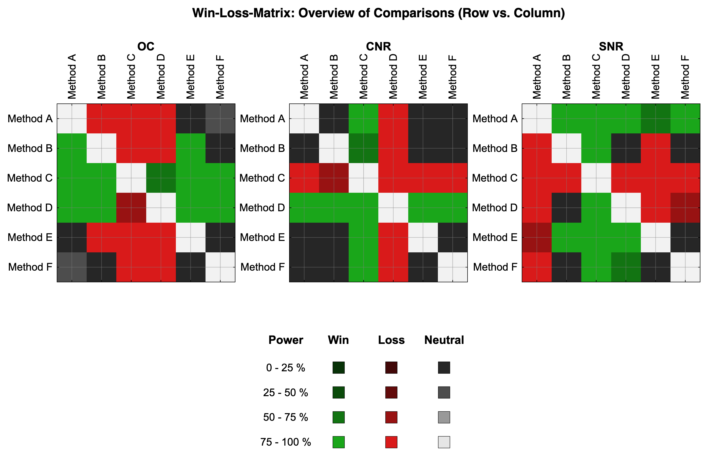
Win-Loss Matrix 2
This matrix visualizes the pairwise comparisons between methods. Blue indicates a win, orange a loss, and gray neutral due to the Threshold criteria not being satisfied. The color intensity indicates the power of each comparison.